
Button: Allow Users to Submit Actions
Published: Updated:
The Button element in ClickFunnels is essential for adding call-to-action buttons to your pages. This element allows visitors to perform various actions, such as submitting a form, navigating to the next funnel step, and more. In this article, we’ll guide you through adding and customizing the Button element to suit your funnel needs.

Requirements
Section titled “Requirements”-
An active ClickFunnels account
-
A page created in your workspace
Adding a Button Element in the Page Editor
Section titled “Adding a Button Element in the Page Editor”-
Inside the page editor, add a Section where you want to place the element.
-
Add a Row within that section.
-
Click the orange + Plus or Add New Element button inside the row to insert a new element.
-
From the Form category, select the Button element.

Once the Button element is added, you can customize its appearance to fit your page design.
Customizing the Button Element
Section titled “Customizing the Button Element”When you hover over an element, its border will be highlighted in orange. To access an element’s settings, click on the gear ⚙️ icon or click directly on the element.
Button Templates
The Button Templates option lets you quickly style your button by selecting from various pre-designed templates. These templates provide a range of styles, from simple flat designs to gradient, bordered, and 3D effects, enabling you to choose a look that best matches your page’s design with just one click.

To apply a template, navigate to the Templates tab in the button settings and select your preferred style. Once applied, you can customize the button’s appearance under the Settings and Advanced tabs, allowing you to adjust colors, fonts, and other properties for a fully tailored look.
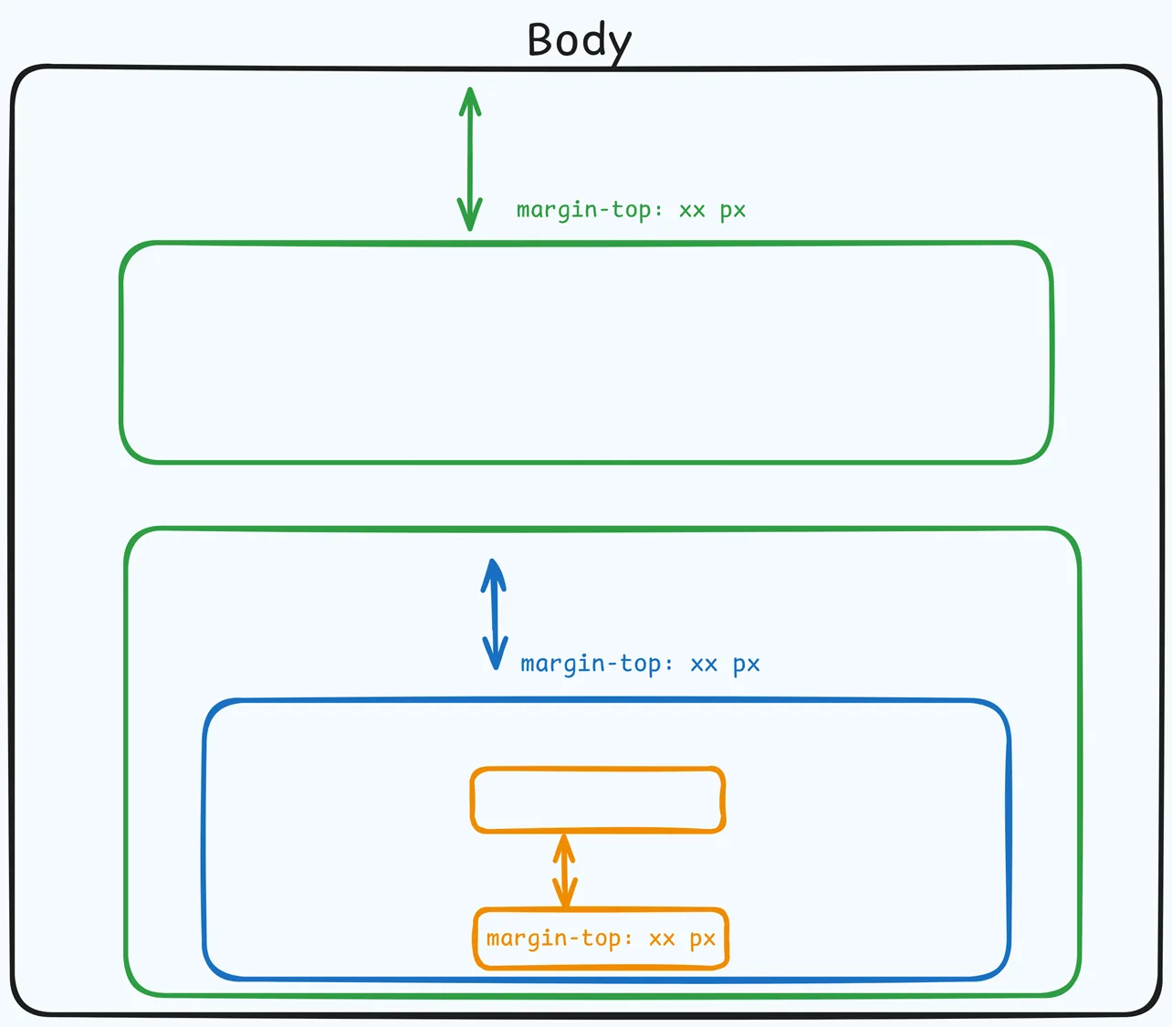
Top Margin
 The Top Margin setting lets you control the space between the current container (section, row, flex, and element) and the container directly above it. If no previous container exists, the margin will be applied relative to the parent container. If no preceding container is added, the Body will be the parent.
You can set top margin values independently for desktop and mobile by using the device icons (🖥️ & 📱 ). If no mobile value is specified, it will inherit the desktop setting by default. Use the slider or manually enter a value in pixels (px) or percentage (%) to create consistent spacing across screen sizes.
Button Config
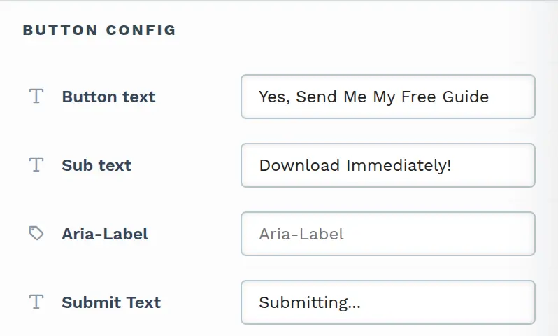
This field allows you to define the main text and sub-text displayed on the button. When you click Edit, additional options become available:
-
Button text: This field allows you to enter the primary text displayed on the button. Customize it to match the action you want users to take, such as “Submit,” “Get My Free Guide,” or any call-to-action relevant to your offer.

-
Sub text: This optional field lets you add additional text below the main button text. Use it to provide extra context or information if needed.
-
Aria-Label: This attribute improves accessibility by giving screen readers additional information about the button’s purpose. Enter a description to help visually impaired users understand the button’s function. Learn more about the aria label in MDN documentation.
-
Submit Text: This field appears only when the button action is Submit Order/Form. It sets the text the button shows while the form is being submitted. If you leave it empty, the button shows Submitting….
Button Action
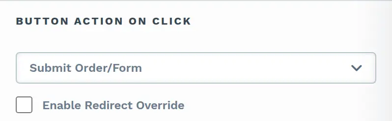
This setting lets you define what happens when a visitor clicks the button. Choose an action from the dropdown in the Button action on click section. The available actions include:
-
Nothing Happens: Selecting the Nothing Happens option does nothing when clicking the button.
-
No Link: When clicked, this button automatically moves the customer to the next step in your funnel sequence. It’s most commonly used on OTO pages to let customers decline the offer and continue through the funnel. Clicking this button will not purchase the product associated with the page. Instead, the customer is simply advanced to the next funnel step.
-
Go To…: When you select Go To…, a dropdown appears where you choose one of four link types: Custom URL, Custom Action Link, Store Page, or Blog Home Page. Every link type also has an Open in new window checkbox to open the link in a new browser tab.
-
Custom URL: This option lets you enter a specific URL (a “hard link”) to which the button will redirect upon clicking. This can be an external website or any URL you want to send the user. The field always adds
https://in front of what you type, so use it only for web addresses. For phone, text message, or email links (tel:,sms:, ormailto:), use Custom Action Link instead. -
Custom Action Link: Instead of linking directly to a hard-coded URL, you can use a relative path or a custom action command (e.g.,
#open-popupor/terms-and-condition). This flexibility allows you to create dynamic links within your page that trigger actions such as opening a pop-up or navigating to a page that matches the path name associated with the same domain. The link is saved exactly as you type it, so this is also where you enter phone, text message, and email links such astel:+1234567890. -
Store Page: This option links directly to your funnel’s connected store front page. It’s useful for buttons that need to take users to product listings or shop-related content. You may enable Open in new window to launch the store page in a new tab.
-
Blog Home Page: This option redirects the user to the main blog page of your site. It’s ideal for promoting or linking back to your blog content. The Open in new window checkbox is also available for this option if you prefer the blog to open in a separate tab.
-
-
Submit Order/Form: When you select Submit Order/Form as the button action, you can control the post-submission redirection with the Enable Redirect Override option:
-
Default Behavior: If the Enable Redirect Override box is left unchecked, the button action will follow the default behavior by advancing users to the next step in your ClickFunnels funnel. If the funnel does not have a next step, the form will be submitted, and the page will reload to the current URL.
-
Enable Redirect Override: By checking this box, you can input a custom URL or a relative path to a page URL in the field. When enabled, the button will redirect users to this specified URL after the form submission instead of progressing to the next step in the funnel.
-
-
1 Click Upsell: This option is available only on funnel step pages. It allows you to designate the button as an order submission button for an OTO product. Once selected, click Add Product to assign a specific product along with a designated price, or click Edit Products to manage the products on the funnel step. You can also check Enable Redirect Override to send the customer to a URL you choose after the purchase. The order will be submitted with the OTO offer after clicking the button. If the customer arrives at the page after purchasing a product from a previous page, the button will submit the order without requiring the customer to re-enter payment information. For physical products, ClickFunnels will prompt the user to provide a shipping address for fulfillment. If the customer accesses the page without having made a prior purchase, clicking the button will open a checkout modal for the user to enter payment information and complete the transaction.
-
Scroll To…: Selecting Scroll To… as the button action allows you to create smooth navigation by scrolling to a specific part of the page when the button is clicked. After selecting Scroll To…, a dropdown menu appears where you can choose the target element, such as a Section, Row, or specific Element. This feature is useful for guiding users to relevant content on the same page, improving the user experience by reducing the need for manual scrolling.
-
Show Or Hide…: The Show Or Hide… action allows you to toggle the visibility of specific elements on the page when the button is clicked. After selecting Show Or Hide…, two dropdown menus appear:
-
Show…: Choose elements, sections, or rows that will be displayed when the button is clicked.
-
Hide…: Select elements, sections, or rows that will be hidden when clicking the button.
-
-
Open Pop-up…: Opens the page pop-up window, which could contain additional information, forms, or calls to action.
-
Close Pop-up…: Closes the active pop-up window.
-
Mark Complete…: Marks the current lesson as complete in a course and takes the student to the next lesson they haven’t completed yet, skipping lessons already marked complete. Once every lesson in the course is complete, it takes the student back to the first lesson instead. To move students forward in outline order regardless of completion, use Go to Next Lesson….
-
Go to Next Lesson…: Takes the student to the next lesson in the course outline order, whether or not that lesson is already complete, continuing into the next module when needed. Lessons the student can’t access, such as unpublished lessons or lessons in a module they don’t have access to, are skipped. On the last lesson, the button takes the student to the course page. This action only navigates — it does not mark the current lesson as complete — which makes it useful for students rewatching a course they have already finished.
-
Go Back to Previous Lesson…: Selecting this action takes the user to the previous lesson in the course outline order, skipping any lessons they can’t access. This action does not alter the completion status of the current lesson, making it useful for revisiting earlier content without resetting progress.
-
Restart Lesson…: This action clears the completion status of the current lesson and reloads it. It is particularly useful in course lessons where users may need to repeat the material from the beginning for better understanding.
To learn more about editing and customizing course pages, refer to Using the Page Editor to Design Your Course. -
Redirect to Next Step: When clicking the button, this action automatically takes the user to the next step in your funnel sequence. It’s a quick way to guide visitors through the funnel progression without manually specifying a URL.
-
Download File…: This action turns the button into a file download. Click Choose File to open the Select File dialog, then search your workspace’s existing Downloads by name or click Upload New File to upload one without leaving the editor — a newly uploaded file is selected on the button automatically. Once a file is attached, its name is shown and the button becomes Change File. Use the Open in new tab (instead of downloading) checkbox to control the click behavior: leave it unchecked (the default) to force a download in the same tab, or check it to open the file in a new browser tab instead (for example, viewing a PDF in the browser’s PDF viewer). Learn more in the article Turn a Button Into a File Download.
Size & Spacing
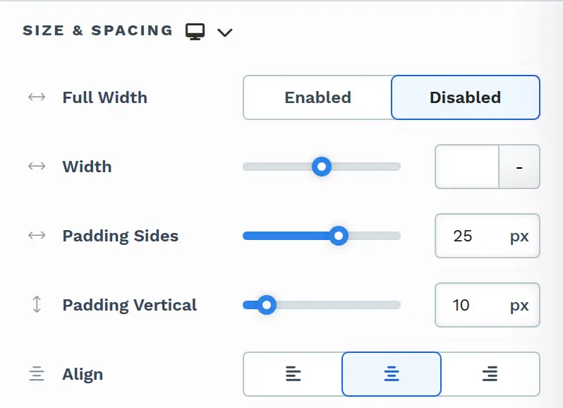
The Size & Spacing settings allow you to control the size and positioning of the button within its container. You can set the size and spacing independently for desktop and mobile by using the device icons (🖥️ & 📱 ). If mobile alignment is not specified, it will inherit the desktop alignment by default. Here’s how each option works:
-
Full Width: Choose Enabled to make the button span its entire container width, stretching to fill the available space horizontally for a prominent, full-width appearance. Choose Disabled to make the button only take up as much space as needed based on its content.
-
Width: Set a fixed button width for designs where full width is too wide. Use the slider or enter a value in pixels (up to 1200px on the slider) or percentage (
%). Choosing Enabled or Disabled under Full Width replaces this value. -
Padding Sides: Adjust the padding on the left and right sides of the button. Increase this value to widen the button while keeping it centered within its container.

-
Padding Vertical: Adjusts the padding on the top and bottom of the button. This setting helps control the button’s height, making it appear larger or smaller vertically.
-
Align: Align the button to the left, center, or right of its container. This option is hidden when Full Width is set to Enabled.
Button Style
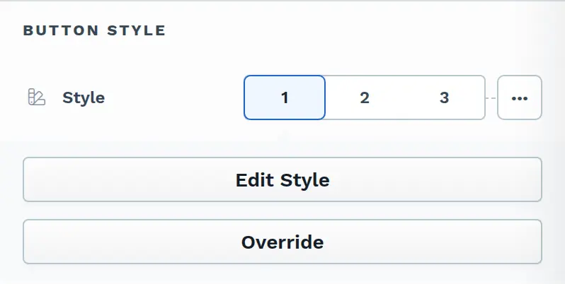
The Button Style settings allow users to apply and customize pre-defined styles or override them for specific adjustments. Here’s a guide to using these settings:
-
Style Selection: You can choose from three pre-defined styles (1, 2, and 3) on the page globally. Selecting one of these styles applies the pre-set look to the button.
-
Edit Style: By clicking Edit Style, you can edit the properties of the selected style directly within the editor. This option adjusts the style globally and impacts all buttons using it.
-
Override: If you want to customize the style for a specific button instance without affecting other buttons, you can select the Override option. This unlocks the button style properties, allowing individual customization. When Override is enabled, additional style settings become accessible, divided into the following sections:
Button States
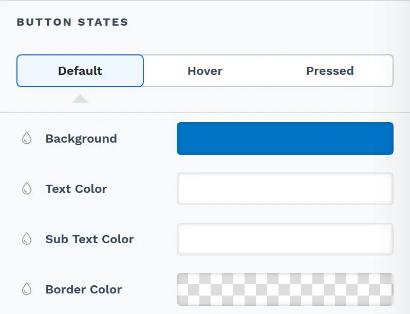
Section titled “Button States”The Button States settings allow you to define how the button appears in different interaction states:
-
Default: The normal appearance of the button when it’s idle. For example, you might set the background to blue, with white text and gray sub-text color to give the button a clean, standard look.
-
Hover: The appearance of the button when a user hovers over it. This state can include changes to the background, text color, or sub-text color to indicate interactivity. For instance, when the user moves their mouse over the button, the background could change to a darker shade of blue, the text color could become a brighter white, and the sub-text might switch to bold, signaling that the button is clickable.
-
Pressed: The appearance of the button when it’s clicked or pressed, providing visual feedback to the user. In this state, you might set the background to dark gray, change the text color to white, and switch the sub-text color to red, giving clear feedback that the action has been registered.
Each state allows customization of the Background, Text Color, Sub Text Color, and Border Color to create a cohesive and responsive design. Each button state (Default, Hover, and Pressed) includes these settings, allowing you to create distinct appearances for each interaction state. Sub Text Color appears only when the button has sub text.
-
Background: This setting controls the button’s background color for each state. For example, you might choose a primary color like blue for the Default state, a darker shade of blue for Hover, and a neutral color like gray for Pressed. Adjusting the background color for each state helps visually communicate interactivity.
-
Text Color: This setting changes the color of the main text on the button. For instance, in the Default state, you may set the text color to white for readability against a colored background. In the Hover state, you might choose a slightly brighter or contrasting shade to make the text stand out more, and in the Pressed state, you could select a color that pairs well with the background to maintain visibility.
-
Sub Text Color: This setting controls the color of any sub-text displayed on the button. For example, you may set a subtle gray color for the Default state, switch to a bolder shade on Hover to highlight interactivity, and use a distinct color like red for Pressed to signal that the button has been activated.
-
Border Color: This setting controls the color of the button’s border in each state.
Primary Text Style
Section titled “Primary Text Style”The Primary Text Style section controls the appearance of the main button text. Each option allows customization to create a clear and engaging call-to-action.
-
Button Font: Select the font type for your primary button text. ClickFunnels provides a range of Google Fonts, and you can also upload custom fonts by navigating to Workspace Settings > My Assets > Fonts. Uploaded fonts will appear in the selection list.
-
Weight: Defines the thickness of the primary button text. The weights available depend on the selected font. Choose a bold weight to create impact or a lighter weight for a more subtle look.
-
Font Size: You can adjust the text size using the slider or manually input a specific value. Additionally, you can choose between rem or px for the size measurement, such as 2rem or 32px. You can also set font size values independently for desktop and mobile by using the device icons (🖥️ & 📱 ).
-
Rem is a relative unit based on the base font size defined in your style guide. For example, if you select a text size of 2rem and your style guide specifies a base font size of 16px for desktop, the resulting text size will be 32px for desktop view (i.e., 2rem × 16px = 32px).
-
Px is an absolute measurement, providing precise control over the text size.
-
-
Letter Spacing: Control the spacing between characters in the primary text. Increase the value for a more spaced-out look, or decrease it for tighter character spacing.
-
Line Height: This adjusts the vertical spacing between lines, which is useful if the button text has multiple lines. A higher line height increases the spacing, while a lower one brings the lines closer together.
-
Text Casing: Choose none (-), lowercase (aa), uppercase (AA), or capitalized (Aa) for the primary button text to control its presentation.
-
Decoration: Style the primary text with underline, strikethrough (line through), or underline + overline to make it stand out or emphasize certain elements.
Sub Text Style
Section titled “Sub Text Style”The Sub Text Style section customizes the appearance of any secondary text displayed below the primary button text. It appears only when the button has sub text. Here’s an overview of each option:
-
Margin Top: Adjusts the vertical space between the primary text and the sub-text. Increasing this value moves the sub-text further down, creating more separation between the two text elements.
-
Button Font: Select the font type for your button subtext. ClickFunnels provides a range of Google Fonts, and you can also upload custom fonts by navigating to Workspace Settings > My Assets > Fonts. Uploaded fonts will appear in the selection list.
-
Weight: Defines the thickness of the sub-text, with options for a subtle, lightweight appearance or a bold, emphasized look. The weights available depend on the selected font.
-
Font Size: You can adjust the text size using the slider or manually input a specific value. Additionally, you can choose between rem or px for the size measurement, such as 2rem or 32px. You can also set font size values independently for desktop and mobile by using the device icons (🖥️ & 📱 ).
-
Rem is a relative unit based on the base font size defined in your style guide. For example, if you select a text size of 2rem and your style guide specifies a base font size of 16px for desktop, the resulting text size will be 32px for desktop view (i.e., 2rem × 16px = 32px).
-
Px is an absolute measurement, providing precise control over the text size.
-
-
Letter Spacing: Adjust the spacing between characters in the sub-text, allowing for either a more open or condensed presentation.
-
Line Height: This controls the vertical spacing between lines of subtext, which is especially useful for multi-line subtext. A higher line height adds more space between lines, while a lower one brings them closer.
-
Text Casing: Adjust the capitalization of the sub-text with options for none (-), lowercase (aa), uppercase (AA), or capitalized (Aa), giving flexibility in presentation.
-
Decoration: Use underline, strikethrough (line through), or underline + overline to highlight the subtext, adding emphasis and making the text stand out.
Border
The Border settings enable you to add and style borders around an element, allowing for enhanced visual definition and separation on the page:

-
Style Presets (1, 2, 3): Choose from predefined border styles in your Style Guide. These presets provide consistent border styles across your page and can be quickly applied to elements.
-
Edit Style: To modify the preset border styles in the Style Guide (affecting all elements using that style), select Edit Style to adjust the design in your global settings.
-
Override: Use the Override option to customize the border settings specifically for this element without impacting the global Style Guide settings.
-
Borders: Select which sides of the element should display a border. Options include any combination of top, bottom, left, and right borders.
-
Border Style: To fit your design preferences, choose the border’s line style, such as solid, dashed, or dotted.
-
Color: Use the color picker to select a border color. You can choose a color from the Style Guide or select a custom color, ensuring the border color aligns with your design scheme.
-
Stroke Size: You can adjust the border’s thickness using the Stroke Size slider or by inputting a specific pixel value, creating anything from thin outlines to bold frames.
Corner
The Corner settings let you adjust the roundness (border-radius) of an element’s corners, providing flexibility to create either rounded or sharp edges:

-
Style Presets (1, 2, 3): Choose from predefined corner styles set in your Style Guide. These presets (1, 2, or 3) offer quick styling options that align with your page’s overall design.
-
Edit Style: To modify a style directly in the Style Guide (affecting all elements using that style), click Edit Style to adjust the preset in your global settings.
-
Override: To apply custom corner settings without changing the Style Guide, click Override. This allows you to tailor the corner radius for this specific element only.
-
All Corners: Adjust the slider or enter a specific value in pixels or percentages to set a uniform border radius for all four corners.
-
Separate Edges: Enable Separate Edges to adjust each corner independently. You can set different values for the Top Left, Top Right, Bottom Left, and Bottom Right corners to achieve unique shapes.
Icon Before
The Icon Before settings allow you to add an icon that appears before the text in your element, such as in Headline, Sub-Headline, Paragraph, Button, etc. Here’s a breakdown of the options:

-
Icon Picker: This option lets you choose an icon from the list. You can select from various icons, such as checkmarks, arrows, or envelopes, to best match your design needs. The icons are loaded from the Font Awesome library, giving you access to numerous icons to fit your design preferences.
-
Icon Size: Adjust the icon size using the slider or enter a specific value in pixels (
px) orrem. You can set the icon size independently for desktop and mobile by using the device icons (🖥️ & 📱 ). -
Icon Color: Customize the icon’s color to match your branding or page design.
-
Margin Left / Margin Right: The Margin Left and Margin Right sliders enable you to control the spacing between the icon and the surrounding content, allowing for precise alignment and positioning.
Icon After
The Icon After settings allow you to add an icon that appears after the text, with the same customization options as Icon Before:

-
Icon Picker: This option lets you choose an icon from the list. You can select from various icons, such as checkmarks, arrows, or envelopes, to best match your design needs. The icons are loaded from the Font Awesome library, giving you access to numerous icons to fit your design preferences.
-
Icon Size: Adjust the icon size using the slider or enter a specific value in pixels (
px) orrem. You can set the icon size independently for desktop and mobile by using the device icons (🖥️ & 📱 ). -
Icon Color: Customize the icon’s color to match your branding or page design.
-
Margin Left / Margin Right: The Margin Left and Margin Right sliders enable you to control the spacing between the icon and the surrounding content, allowing for precise alignment and positioning.
Control Panel
The Control Panel appears at the bottom of every container(Section, Row, Flex, and Element) in the page editor, offering quick access to essential settings and actions for that container. Here’s what each icon represents:

-
ALL: The container will be visible on all devices (desktop, tablet, and mobile).
-
Desktop (🖥️) Icon: The container will only be visible in desktop view (screens 771px and wider).
-
Mobile (📱) Icon: The container will only be visible in mobile view (screens up to 770px wide).
-
Eye (👁️) Icon: Hides the container on all devices. It isn’t deleted. To show it again, select All, Desktop, or Mobile in this panel, or open Layout in the top bar and turn the container’s desktop or mobile toggle back on.
-
Code (
</>): Opens the code editor for this container, where you can add custom CSS to change its styling. The editor shows the container’s CSS ID Selector so your CSS targets only this container. Open it from the code icon at the top of the settings panel, or hover over the container on the page and click Code in its toolbar. -
Trash (🗑️) Icon: Removes the container from the page editor entirely.
Advanced Settings
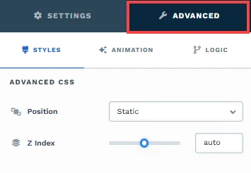
To further customize your container (section, row, column, and element), ClickFunnels provides Advanced settings that allow you to control style, advanced CSS, animation, and rendering logic. We’ve separated these advanced features into dedicated articles to avoid overwhelming you with too much content in one place and to keep our documentation concise. Explore the following resources for more details:
-
Advanced Settings - Customize Styles: Learn how to populate contents dynamically, position containers, and apply z-index.
-
Advanced Settings - Customize Animation: Learn how to add animations, control entry and exit effects, and adjust animation delay.
-
Advanced Settings - Customize Logic: Learn how to apply conditional logic to elements and add custom attributes.