
(Collections) Lessons: Arrange and Display Course Lessons
Published: Updated:
The Lessons collection element is designed to help you organize and display your course lessons dynamically. This element ensures students can easily navigate through lessons within a course, providing a clear and structured learning experience. In this article, we’ll show you how to add the Lessons element to a page, customize its settings, and make the most of its features for a polished course layout.
Requirements
Section titled “Requirements”-
An active ClickFunnels account
Where You Can Use The Lessons Element
Section titled “Where You Can Use The Lessons Element”This element is most relevant for the following pages:
Adding The Lessons Element
Section titled “Adding The Lessons Element”-
Open the ClickFunnels page editor for the page where you want to display your Lessons.
-
Click Add Element in the desired row to open the Elements menu.
-
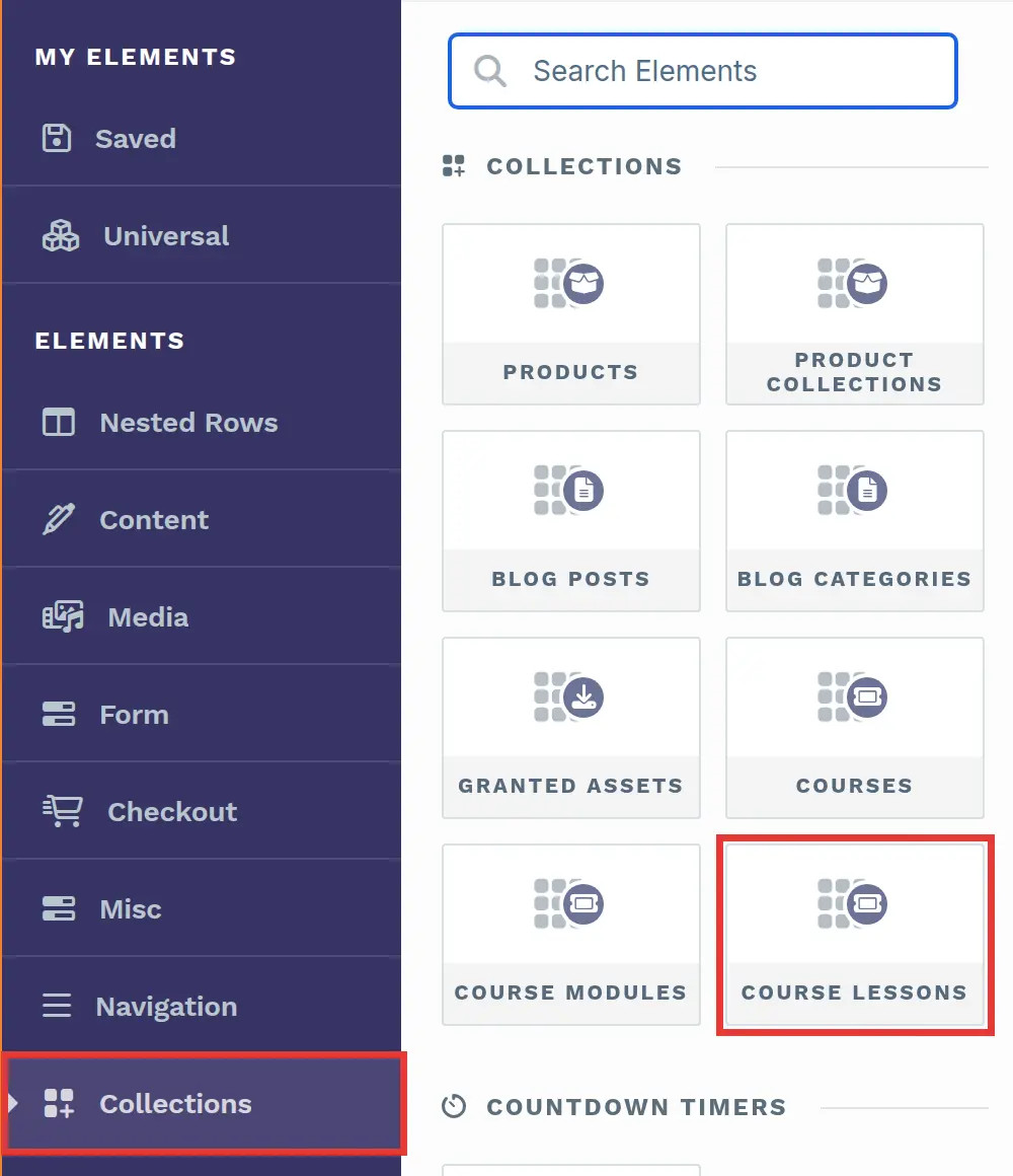
Scroll to the Collections section and select the Course lessons element.
-
Next, you will be prompted to select the number of columns you want to add inside the container.
-
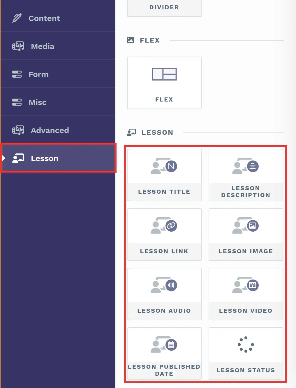
Add dynamic details such as Lesson title, Lesson image, and Lesson link, which automatically pull data from your lesson settings to keep your page updated. You can include the following elements:
-
Lesson title: Displays the lesson name.
-
Lesson description: Adds a brief description of the lesson.
-
Lesson link: Provides a clickable link to access the lesson.
-
Lesson image: Displays the featured image for the lesson.
-
Lesson audio: Embeds the lesson’s audio file.
-
Lesson video: Embeds the lesson’s video.
-
Lesson published date: Shows when the lesson was published.
-
Lesson Status: Shows Completed if the visitor has completed the lesson. Otherwise, it shows a Start Lesson link to the lesson. You can change both texts in the element’s settings.
-
-
Click on each element to access its settings. Adjust fonts, colors, spacing, and layout to match your page’s design for a cohesive look.
Customizing The Lessons Element
Section titled “Customizing The Lessons Element”Accessing Settings
Section titled “Accessing Settings”When you hover over a collection element, its border will be highlighted in magenta. To access its settings, click on the g****ear ⚙️ icon or click directly on the element.

Top Margin
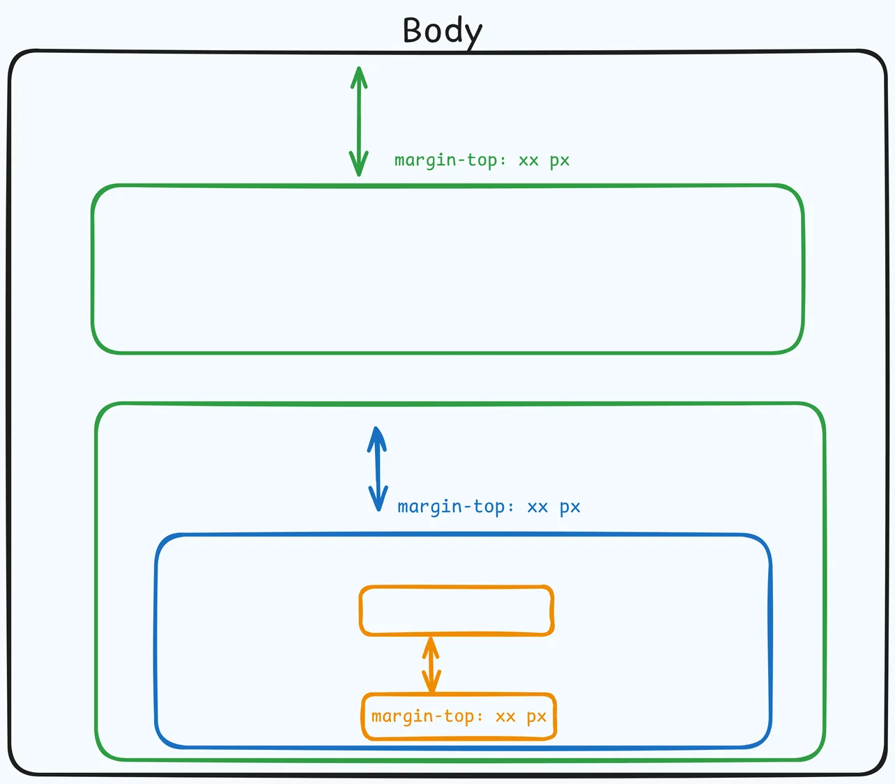
 The Top Margin setting lets you control the space between the current container (section, row, flex, and element) and the container directly above it. If no previous container exists, the margin will be applied relative to the parent container. If no preceding container is added, the Body will be the parent.
You can set top margin values independently for desktop and mobile by using the device icons (🖥️ & 📱 ). If no mobile value is specified, it will inherit the desktop setting by default. Use the slider or manually enter a value in pixels (px) or percentage (%) to create consistent spacing across screen sizes.
Collection Settings
 The Collection Settings let you configure how grid items (cards) are arranged and paginated inside the container.
-
Items Per Row: Choose how many items appear on each row of the grid. The layout will wrap to new rows and adapt on smaller screens automatically.
-
Items per page: Set the total number of items rendered on a single page in the container. If the collection has more than this number, ClickFunnels creates additional pages.
-
Hide pagination: Hides the page numbers below the collection. The collection still shows only the number of items set in Items per page, so visitors can’t reach items beyond the first page. To show every item without page numbers, set Items per page high enough to include all of them (up to 100), then turn on Hide pagination.
-
Pagination Item Color: Color of the pagination items’ text/icons (e.g., the numbers 1, 2, 3).
-
Pagination Item Background Color: Background color for non‑active pagination items.
-
Pagination border color: Border color around each pagination item.
-
Pagination Active Item Color: Text/icon color for the current (active) page item.
-
Pagination Active Item Background Color: Background color for the active page item.
-
Pagination Active Border Color: Border color for the active page item.
Advanced Settings
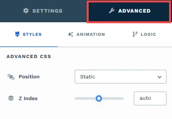
To further customize your container (section, row, column, and element), ClickFunnels provides Advanced settings that allow you to control style, advanced CSS, animation, and rendering logic. We’ve separated these advanced features into dedicated articles to avoid overwhelming you with too much content in one place and to keep our documentation concise. Explore the following resources for more details:
-
Advanced Settings - Customize Styles: Learn how to populate contents dynamically, position containers, and apply z-index.
-
Advanced Settings - Customize Animation: Learn how to add animations, control entry and exit effects, and adjust animation delay.
-
Advanced Settings - Customize Logic: Learn how to apply conditional logic to elements and add custom attributes.
Control Panel
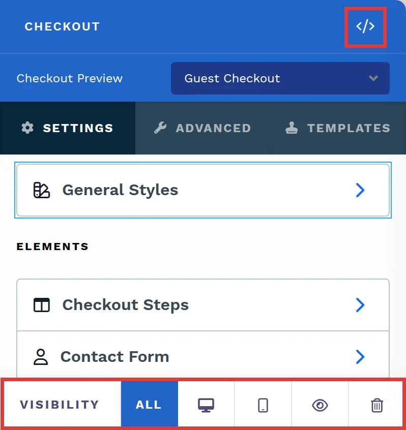
The Element Control Panel appears at the bottom of every element in the page editor, offering quick access to essential settings and actions for that element. Here’s what each icon represents:
-
ALL: The element will be visible on all devices (desktop, tablet, and mobile).
-
Desktop Icon: The element will only be visible on the desktop view.
-
Mobile Icon: The element will only be visible on mobile view.
-
Eye Icon: Use this to hide the element from the page. The element will still be present in the editor but invisible to visitors.
-
Code (
</>): Opens the code editor for this container, where you can add custom CSS to change its styling. The editor shows the container’s CSS ID Selector so your CSS targets only this container. Open it from the code icon at the top of the settings panel, or hover over the container on the page and click Code in its toolbar. -
Trash Icon: Removes the element from the page editor entirely.