
Sidebar: Add Course Sidebar Navigation to Course Pages
Published: Updated:
The Sidebar element makes it easy for students to navigate your course by displaying your course structure directly on the page. This element pulls information from your course outline, showing modules and lessons to guide students through their learning path. It’s ideal for use on Course Home, Module, and Lesson pages. This article will show you how to add and configure the Sidebar element so it fits perfectly with your course design.
Requirements
Section titled “Requirements”-
An active ClickFunnels account
Adding The Sidebar Element to Your Course Pages
Section titled “Adding The Sidebar Element to Your Course Pages”-
Navigate to the Courses app in your ClickFunnels dashboard left-hand menu.
-
Select the course you want to customize and click Customize to access the course page editor.
-
To edit a Course Home, Module, or Lesson Page:
-
Course Home Page:
- In the Course tab, click Course Home to access the main page layout.

- In the Course tab, click Course Home to access the main page layout.
-
Module and Lesson Pages:
-
Switch to the Templates tab.
-
Locate the Default Module Page or Default Lesson Page templates.
-
Click on the desired template to open it for editing.

-
-
-
Click the orange + Add Element button where you want to place the Sidebar.
-
In the element menu, go to Course and select the Sidebar element.

Customizing The Sidebar Element
Section titled “Customizing The Sidebar Element”Accessing Settings
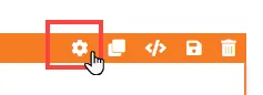
Section titled “Accessing Settings”When you hover over an element, its border will be highlighted in orange. To access an element’s settings, click on the gear ⚙️ icon or click directly on the element.
Top Margin
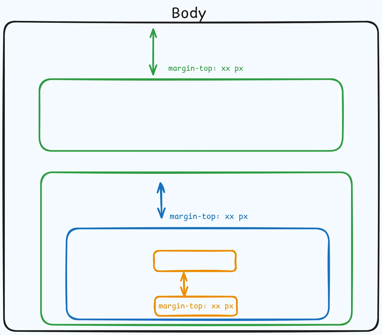
 The Top Margin setting lets you control the space between the current container (section, row, flex, and element) and the container directly above it. If no previous container exists, the margin will be applied relative to the parent container. If no preceding container is added, the Body will be the parent.
You can set top margin values independently for desktop and mobile by using the device icons (🖥️ & 📱 ). If no mobile value is specified, it will inherit the desktop setting by default. Use the slider or manually enter a value in pixels (px) or percentage (%) to create consistent spacing across screen sizes.
Mobile Preview
The Mobile Preview setting appears at the top of the Sidebar’s settings panel. On mobile, the Sidebar opens from a hamburger menu. Choose Show Modal to open that mobile menu in the editor so you can see and style it, or Hide Modal to close it again. This setting only affects the editor, not your published page.
Render Mode
The Render Mode setting in the Sidebar element determines how the course content is displayed and organized in the navigation menu.
Classic Mode:
-
Displays a straightforward hierarchical structure for modules and lessons.
-
All modules and lessons are visible as an expandable list, making it easy for users to navigate.
Ascension Mode
-
Organizes content into tabs for each module, with lessons nested underneath the selected tab.
-
Provides a cleaner, more focused layout by displaying one module at a time.
Show Drip Modules
The Show Drip Modules setting in the Sidebar element controls whether to display locked or upcoming course modules and lessons based on the drip schedule. Here’s what each option does: 
-
Yes: Displays all modules, including locked or scheduled ones, giving students a preview of upcoming content.
-
No: Only shows unlocked, accessible modules, keeping the sidebar focused on current content.
To learn more about adding drip modules, check out our How to Manage Course Modules article.
Sidebar Settings
The Sidebar element includes several customizable settings that allow you to tailor its appearance and functionality to match your course layout and design preferences. 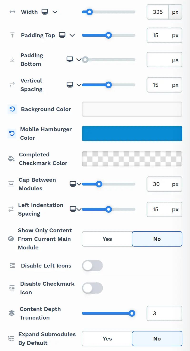
-
Width: Adjust the Sidebar’s width relative to its container (e.g., set to 100% for full width).
-
Padding Top & Bottom: Add vertical spacing within the Sidebar element.
-
Vertical Spacing: Adjust spacing between items in the navigation.
-
Background Color: Set a background color for the Sidebar to match your branding.
-
Mobile Hamburger Color: Choose a color for the mobile version of the navigation menu.
-
Completed Checkmark Color: Change the color of the checkmarks indicating completed lessons and sub-modules.
-
Gap Between Modules: Adjust the space between the top-level modules. Available in Classic mode.
-
Left Indentation Spacing: Adjust the indentation for nested content items.
-
Show Only Content From Current Main Module: Choose Yes to list only the top-level module the student is currently in, or No (default) to list all modules. Available in Classic mode.
-
Disable Left Icons: Hide the icons shown to the left of lessons.
-
Disable Checkmark Icon: Toggle visibility of completion checkmarks.
-
Content Depth Truncation: Set how many levels of content the Sidebar shows inside each top-level module: 2 or 3 (default 3). Content nested deeper than that is hidden. For example, at 2, a sub-module inside another sub-module is still listed, but its lessons aren’t.
-
Expand Submodules By Default: Choose Yes to show sub-modules expanded when the page loads, or No (default) to keep them collapsed until a student clicks the arrow next to them. The sub-module that contains the current page is always expanded.
-
Components: Expand this group to style each part of the Sidebar. The parts listed depend on the Render Mode and are described in the sections below.
Modules Settings
The Modules settings allow you to adjust the appearance of the top-level modules within the Sidebar. This component is available in Classic mode. You can customize the background and text color to ensure the design aligns with your course theme.
-
Top Margin:
The Top Margin setting lets you control the space between the current container (section, row, flex, and element) and the container directly above it. If no previous container exists, the margin will be applied relative to the parent container. If no preceding container is added, the Body will be the parent.You can set top margin values independently for desktop and mobile by using the device icons (🖥️ & 📱 ). If no mobile value is specified, it will inherit the desktop setting by default. Use the slider or manually enter a value in pixels (
px) or percentage (%) to create consistent spacing across screen sizes.
-
Background: Select a background color for the module section to make it visually distinct.
-
Text Color: Choose a color for the text to improve readability or match your course branding.
Navigation Links and Module Tabs
In Ascension mode, the Components group lists Navigation Links and Module Tabs instead of Modules:
-
Navigation Links: Style the links shown above the module tabs. You can set Padding Bottom and Padding Horizontal, add and edit the links, and style the link text with the same state-based settings described under Course Depth Settings.
-
Module Tabs: Style the tabs that list your top-level modules. You can set Vertical Spacing, turn on Same Width Tabs to give every tab the same width, and style the tabs with the same state-based settings described under Course Depth Settings.
Course Depth Settings
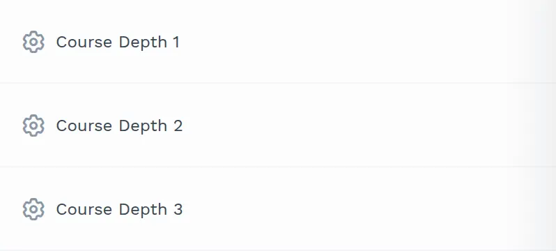
The Course Depth 1, Course Depth 2, and Course Depth 3 components let you style the items at each nesting level of your course separately. They change how items look, not which items appear. To control how many levels the Sidebar shows, use Content Depth Truncation in the Sidebar Settings. The top-level modules themselves are styled with Modules (Classic) or Module Tabs (Ascension).
-
Course Depth 1: Items directly inside a top-level module, such as its lessons and sub-modules.
-
Course Depth 2: Items inside a sub-module.
-
Course Depth 3: Items inside a sub-module that is itself inside a sub-module. These appear only when Content Depth Truncation is set to 3.
Key Settings:
Section titled “Key Settings:”-
Top Margin:
The Top Margin setting lets you control the space between the current container (section, row, flex, and element) and the container directly above it. If no previous container exists, the margin will be applied relative to the parent container. If no preceding container is added, the Body will be the parent.You can set top margin values independently for desktop and mobile by using the device icons (🖥️ & 📱 ). If no mobile value is specified, it will inherit the desktop setting by default. Use the slider or manually enter a value in pixels (
px) or percentage (%) to create consistent spacing across screen sizes.
-
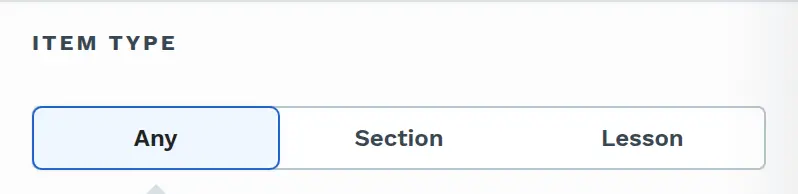
Item Type: Available in Course Depth 1 and Course Depth 2. Choose which items at that level your style changes apply to:
-
Any: Both sub-modules and lessons.
-
Section: Only sub-modules.
-
Lesson: Only lessons.
-
-
Selected State: The Selected State setting allows you to customize the appearance of an item that is currently selected in the Sidebar. For example, if a student is viewing Lesson 2, the text or background of this lesson can appear highlighted to indicate their location.

-
Default: This style applies to items that are not currently selected.
-
Selected: This style applies to the item that is currently selected or active. You can customize the appearance to make it stand out, such as bolding the text or changing the font color.
-
-
Hovered State: The Hovered State setting customizes how an item looks when the user hovers their cursor over it. This helps create an interactive and visually clear navigation experience.

-
Not Hovered: This style applies to items in the Sidebar when the user’s cursor is not over them.
-
Hovered: This style applies when the user’s cursor hovers over a Sidebar item. You can customize this state to make items stand out.
When Item Type, Selected State, and Hovered State are set to Any, Default, and Not Hovered, the panel shows Typography, Background, Text Color, Text Shadow, Border, Shadow, and Corner. When you choose any other option, it shows Typography, Background, Text Color, and Border for that state.
-
-
Typography:
The Typography settings control the text of the items at this level. In the default state, you can select a preset style (S, M, L, or XL) from your style guide, select Edit Style to change that preset everywhere it’s used, or select Override to customize the text for this element only.
-
Font Family: This option allows you to select the font type for your text. ClickFunnels provides a range of popular fonts from the Google Fonts library. Additionally, you can upload and use your own custom fonts by navigating to Workspace Settings > My Assets > Fonts. Once uploaded, your custom fonts will appear in the selection list for use.
-
Weight: This option defines the thickness of the text. The weights you can choose depend on the selected font.
-
Font Size: You can adjust the text size using the slider or manually inputting a specific value. Additionally, you can choose between rem or px for the size measurement, such as 2rem or 32px. You can also set font size values independently for desktop and mobile by using the device icons (🖥️ & 📱 ).
-
Rem is a relative unit based on the base font size defined in your style guide. For example, if you select a text size of 2rem and your style guide specifies a base font size of 16px for desktop, the resulting text size will be 32px for desktop view (i.e., 2rem × 16px = 32px).
-
Px is an absolute measurement, providing precise control over the text size.
-
-
Letter Spacing: Adjust the space between individual letters. You can increase or decrease the value using the slider or input a specific value (measured in rem). More spacing spreads the letters apart, while less spacing brings them closer together. You can also set letter spacing values independently for desktop and mobile by using the device icons (🖥️ & 📱 ).
-
Text Casing: Select how your text should appear in terms of capitalization:
-
Lowercase: All text in lowercase.
-
Uppercase: All text in uppercase.
-
Capitalize: Capitalize the first letter of each word.
-
-
-
Background: Set a background color for the items at this level.
-
Text Color: Choose the text color for the items at this level.
-
Text Shadow:
The Text Shadow section adds a subtle shadow behind your text, creating depth and improving readability. You can control the following parameters:

-
Offset-x and Offset-y: Adjust the horizontal and vertical positioning of the shadow.
-
Blur: Set how blurred or sharp the shadow appears.
-
Color: Choose the shadow color to match or contrast your page design.
-
-
Border:
The Border settings enable you to add and style borders around an element, allowing for enhanced visual definition and separation on the page:

-
Style Presets (1, 2, 3): Choose from predefined border styles in your Style Guide. These presets provide consistent border styles across your page and can be quickly applied to elements.
-
Edit Style: To modify the preset border styles in the Style Guide (affecting all elements using that style), select Edit Style to adjust the design in your global settings.
-
Override: Use the Override option to customize the border settings specifically for this element without impacting the global Style Guide settings.
-
Borders: Select which sides of the element should display a border. Options include any combination of top, bottom, left, and right borders.
-
Border Style: To fit your design preferences, choose the border’s line style, such as solid, dashed, or dotted.
-
Color: Use the color picker to select a border color. You can choose a color from the Style Guide or select a custom color, ensuring the border color aligns with your design scheme.
-
Stroke Size: You can adjust the border’s thickness using the Stroke Size slider or by inputting a specific pixel value, creating anything from thin outlines to bold frames.
-
-
Shadow:
The Shadow settings allow you to add depth and emphasis to elements by applying shadow effects, enhancing the visual appearance. Here’s how to customize shadow properties:

-
Style: Select one of the predefined shadow styles from your page’s style guide. Click on the numbered styles (1, 2, or 3) to apply preset shadow settings defined in your style guide.
-
Shadow Style: Choose between Inset (shadow within the element) and Outset (shadow outside the element) to achieve the desired shadow effect.
-
X-direction: Adjusts the horizontal positioning of the shadow. A positive value moves the shadow to the right, while a negative value shifts it to the left.
-
Y-direction: Controls the vertical placement of the shadow. Positive values push the shadow downward, while negative values pull it upward.
-
Blur: Controls the softness of the shadow edges. Higher values create a more diffused, softer shadow, while lower values keep the shadow sharp.
-
Spread: Adjust the size of the shadow. Positive values expand the shadow, while negative values make it narrower.
-
Color: Use the color picker to choose to set the shadow color.
-
-
Corner: Round the corners of the items at this level, using a corner style from your style guide or your own values.
Border
The Border settings enable you to add and style borders around an element, allowing for enhanced visual definition and separation on the page:
-
Style Presets (1, 2, 3): Choose from predefined border styles in your Style Guide. These presets provide consistent border styles across your page and can be quickly applied to elements.
-
Edit Style: To modify the preset border styles in the Style Guide (affecting all elements using that style), select Edit Style to adjust the design in your global settings.
-
Override: Use the Override option to customize the border settings specifically for this element without impacting the global Style Guide settings.
-
Borders: Select which sides of the element should display a border. Options include any combination of top, bottom, left, and right borders.
-
Border Style: To fit your design preferences, choose the border’s line style, such as solid, dashed, or dotted.
-
Color: Use the color picker to select a border color. You can choose a color from the Style Guide or select a custom color, ensuring the border color aligns with your design scheme.
-
Stroke Size: You can adjust the border’s thickness using the Stroke Size slider or by inputting a specific pixel value, creating anything from thin outlines to bold frames.
Shadow
The Shadow settings allow you to add depth and emphasis to elements by applying shadow effects, enhancing the visual appearance. Here’s how to customize shadow properties:
-
Style: Select one of the predefined shadow styles from your page’s style guide. Click on the numbered styles (1, 2, or 3) to apply preset shadow settings defined in your style guide.
-
Shadow Style: Choose between Inset (shadow within the element) and Outset (shadow outside the element) to achieve the desired shadow effect.
-
X-direction: Adjusts the horizontal positioning of the shadow. A positive value moves the shadow to the right, while a negative value shifts it to the left.
-
Y-direction: Controls the vertical placement of the shadow. Positive values push the shadow downward, while negative values pull it upward.
-
Blur: Controls the softness of the shadow edges. Higher values create a more diffused, softer shadow, while lower values keep the shadow sharp.
-
Spread: Adjust the size of the shadow. Positive values expand the shadow, while negative values make it narrower.
-
Color: Use the color picker to choose to set the shadow color.
Advanced
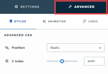
To further customize your container (section, row, column, and element), ClickFunnels provides Advanced settings that allow you to control style, advanced CSS, animation, and rendering logic. We’ve separated these advanced features into dedicated articles to avoid overwhelming you with too much content in one place and to keep our documentation concise. Explore the following resources for more details:
-
Advanced Settings - Customize Styles: Learn how to populate contents dynamically, position containers, and apply z-index.
-
Advanced Settings - Customize Animation: Learn how to add animations, control entry and exit effects, and adjust animation delay.
-
Advanced Settings - Customize Logic: Learn how to apply conditional logic to elements and add custom attributes.