
Content Body: Display Blog Post and Course Lesson Content Dynamically
Published: Updated:
The Content Body element allows you to dynamically display content on the blog posts and course lesson pages. It ensures that when users visit a blog post or course lesson page, the element pulls the specific content associated with it. In this article, we’ll explain how to add the Content Body element to your blog post and course lesson pages and ensure it functions correctly.

Requirements
Section titled “Requirements”-
An active ClickFunnels account
-
A blog post or course lesson created in your workspace
How the Content Body Element Works
Section titled “How the Content Body Element Works”The Content Body is a dynamic element designed specifically to display the contents of individual blog posts and course lessons in an engaging manner. When your viewers access blogs or course lessons and click on any specific blog post or course lesson, the Content Body element has the capability to pull the relevant content associated with the item they clicked on. This process occurs seamlessly: you design the theme page once, and the Content Body element shows the current blog post’s or lesson’s content on that template page.
Step 1: Adding Blog Post or Course Lesson Content
Section titled “Step 1: Adding Blog Post or Course Lesson Content”Adding Blog Post Content
Section titled “Adding Blog Post Content”-
Navigate to the Site & Blog app and select Blog.
-
Create a new post or select an existing one.
-
On the Blog Posts page, click the Pencil ✏️ icon next to your created post.

-
You can add and customize blog content (e.g., text, images, videos, buttons, etc) in the Page Editor using Sections, Rows, and Elements.
-
Once done, click Save Changes to save your edits.
Learn more: How to Create and Manage Blog Posts
Adding Course Lesson Content
Section titled “Adding Course Lesson Content”-
Navigate to the Courses app and select a course to edit.
-
Add a new Module and a new Lesson inside the module.
-
Click the Lesson Name or Edit Lesson option to open the lesson editor.

-
You can add and customize lesson content (e.g., text, images, videos, buttons, etc) in the Lesson Editor using Sections, Rows, and Elements.
-
Once done, click Save Changes to save your edits.
Learn more: How to Manage Course Lessons
Step 2: Adding the Content Body Element
Section titled “Step 2: Adding the Content Body Element”-
Navigate to the Site & Blog app.
-
Click Overview.
-
Click Edit Site to open the site theme pages editor.
-
In the left panel, choose Blog Post from the Blog category or Lesson Page from the Course category to modify the theme pages. If your modules have their own content (added with Edit Content on the module), also add the element to the Module Lessons page.

-
Inside the page editor, add a Section where you want to place the element.
-
Add a Row within that section.
-
Click the orange + Plus or Add New Element button inside the row to insert a new element.
-
From the Advanced category, scroll to the Dynamic Slots section and select the Content Body element.

Customizing the Content Body Element
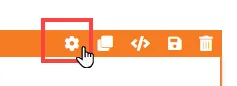
Section titled “Customizing the Content Body Element”When you hover over an element, its border will be highlighted in orange. To access an element’s settings, click on the gear ⚙️ icon or click directly on the element.
Top Margin
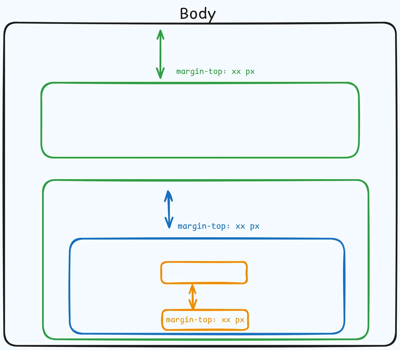
 The Top Margin setting lets you control the space between the current container (section, row, flex, and element) and the container directly above it. If no previous container exists, the margin will be applied relative to the parent container. If no preceding container is added, the Body will be the parent.
You can set top margin values independently for desktop and mobile by using the device icons (🖥️ & 📱 ). If no mobile value is specified, it will inherit the desktop setting by default. Use the slider or manually enter a value in pixels (px) or percentage (%) to create consistent spacing across screen sizes.
Control Panel
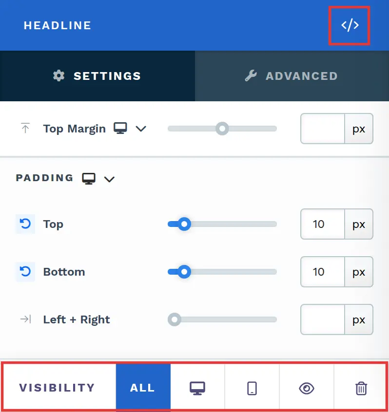
The Control Panel appears at the bottom of every container(Section, Row, Flex, and Element) in the page editor, offering quick access to essential settings and actions for that container. Here’s what each icon represents:
-
ALL: The container will be visible on all devices (desktop, tablet, and mobile).
-
Desktop (🖥️) Icon: The container will only be visible in desktop view (screens 771px and wider).
-
Mobile (📱) Icon: The container will only be visible in mobile view (screens up to 770px wide).
-
Eye (👁️) Icon: Hides the container on all devices. It isn’t deleted. To show it again, select All, Desktop, or Mobile in this panel, or open Layout in the top bar and turn the container’s desktop or mobile toggle back on.
-
Code (
</>): Opens the code editor for this container, where you can add custom CSS to change its styling. The editor shows the container’s CSS ID Selector so your CSS targets only this container. Open it from the code icon at the top of the settings panel, or hover over the container on the page and click Code in its toolbar. -
Trash (🗑️) Icon: Removes the container from the page editor entirely.
Advanced Settings
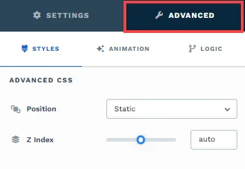
To further customize your container (section, row, column, and element), ClickFunnels provides Advanced settings that allow you to control style, advanced CSS, animation, and rendering logic. We’ve separated these advanced features into dedicated articles to avoid overwhelming you with too much content in one place and to keep our documentation concise. Explore the following resources for more details:
-
Advanced Settings - Customize Styles: Learn how to populate contents dynamically, position containers, and apply z-index.
-
Advanced Settings - Customize Animation: Learn how to add animations, control entry and exit effects, and adjust animation delay.
-
Advanced Settings - Customize Logic: Learn how to apply conditional logic to elements and add custom attributes.