
Store Search: Enable Users to Search Your Store
Published: Updated:
The Store Search element in ClickFunnels enables customers to quickly find products within your store, improving their shopping experience. By adding and customizing the Store Search, you can help users easily locate items, especially within large product collections. This article will guide you through adding the Store Search element to your storefront and personalizing its appearance. 
Requirements
Section titled “Requirements”-
An active ClickFunnels account
-
The Store app
-
Ensure that each product included in the “Product Collection” is set to be visible in the Online Store.
How to Add the Store Search Element
Section titled “How to Add the Store Search Element”-
In your ClickFunnels dashboard, navigate to the Store app and select Overview.
-
Click Customize Store to open the Store Theme Editor.
-
In the left-hand menu, under Site theme pages, choose the page where you’d like to add the search bar.
-
Inside the selected page, click Add Element within a row to open the Elements menu.
-
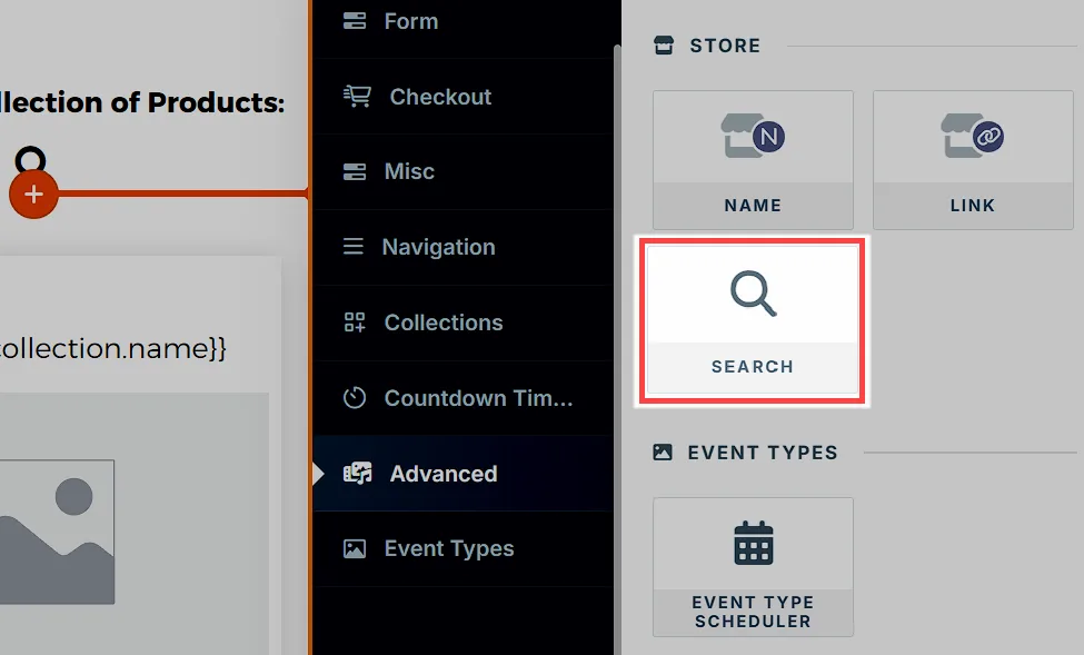
In the Elements, select Search from the Store category.
Customizing the Store Search Element
Section titled “Customizing the Store Search Element”Accessing Settings
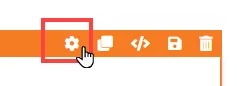
Section titled “Accessing Settings”When you hover over an element, its border will be highlighted in orange. To access an element’s settings, click on the gear ⚙️ icon or click directly on the element.
Preview
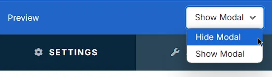
Section titled “Preview”Use this setting to test how the modal will appear with or without search results.
-
Hide Modal: Hides the modal, allowing you to preview only the search bar element.
-
Show Modal: Displays the modal with placeholder content, such as product names and images, so you can see the layout and design before saving.
Top Margin
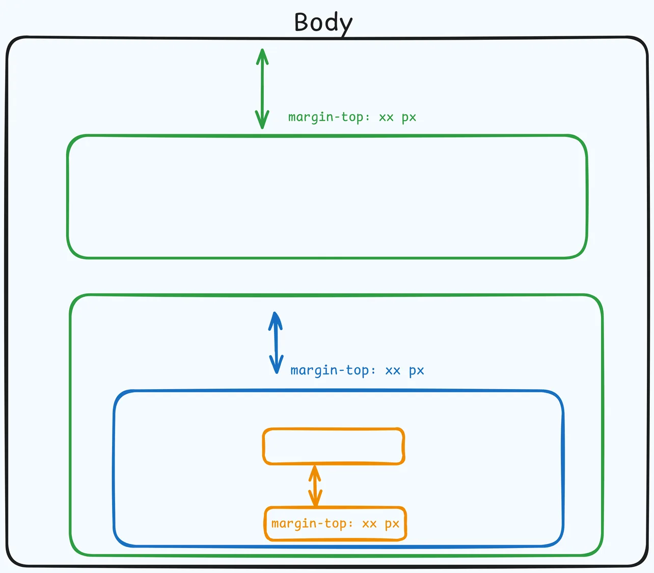
 The Top Margin setting lets you control the space between the current container (section, row, flex, and element) and the container directly above it. If no previous container exists, the margin will be applied relative to the parent container. If no preceding container is added, the Body will be the parent.
You can set top margin values independently for desktop and mobile by using the device icons (🖥️ & 📱 ). If no mobile value is specified, it will inherit the desktop setting by default. Use the slider or manually enter a value in pixels (px) or percentage (%) to create consistent spacing across screen sizes.
Search Icon
Adjust how the search icon appears within the search bar. 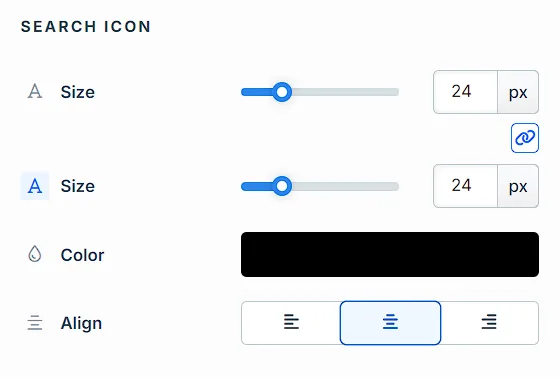
-
Size: Set the icon size in pixels to match your design needs.
-
Color: Choose a color for the icon that aligns with your store’s theme.
-
Alignment: Position the icon to the left, center, or right within the search bar.
General
Customize the overall appearance and functionality of the Store Search modal. 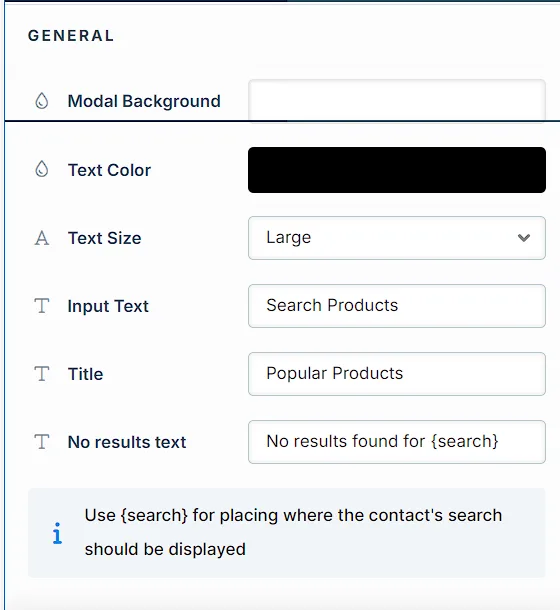
-
Modal Background: Select a background color for the search results modal.
-
Text Color: Choose the color for text displayed in the modal to enhance readability.
-
Text Size: Adjust the font size for modal text; options include Small, Medium, and Large.
-
Input Text: Set placeholder text in the search bar (e.g., “Search Products”) to guide users on how to search.
-
Title: Enter a title (e.g., “Popular Products”) that appears above the search results.
-
No Results Text: Customize the message shown when no products match the search term. Use
{search}as a placeholder to display the term entered by the user (e.g., “No results found for {search}”).
Advanced Settings
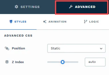
To further customize your container (section, row, column, and element), ClickFunnels provides Advanced settings that allow you to control style, advanced CSS, animation, and rendering logic. We’ve separated these advanced features into dedicated articles to avoid overwhelming you with too much content in one place and to keep our documentation concise. Explore the following resources for more details:
-
Advanced Settings - Customize Styles: Learn how to populate contents dynamically, position containers, and apply z-index.
-
Advanced Settings - Customize Animation: Learn how to add animations, control entry and exit effects, and adjust animation delay.
-
Advanced Settings - Customize Logic: Learn how to apply conditional logic to elements and add custom attributes.
Control Panel
The Element Control Panel appears at the bottom of every element in the page editor, offering quick access to essential settings and actions for that element. Here’s what each icon represents:

-
ALL: The element will be visible on all devices (desktop, tablet, and mobile).
-
Desktop Icon: The element will only be visible on the desktop view.
-
Mobile Icon: The element will only be visible on mobile view.
-
Eye Icon: Use this to hide the element from the page. The element will still be present in the editor but invisible to visitors.
-
Code Icon: This icon opens the code editor, where you can insert custom CSS or JavaScript code to modify the element’s behavior or styling.
-
Trash Icon: Removes the element from the page editor entirely.