
Page Editor: Adding Elements
Published: Updated:
Elements are the building blocks of your page in ClickFunnels. From headlines and images to buttons and forms, elements allow you to add various types of content and functionality to your page. This article will guide you through adding elements to your page, adjusting their settings, and customizing their style to match your design.

Requirements
Section titled “Requirements”-
An active ClickFunnels account
-
A section, row, or flex container added to the editor
Adding an Element in the Page Editor
Section titled “Adding an Element in the Page Editor”-
In your ClickFunnels account, navigate to the page where you want to add a new section.
-
Click on the page thumbnail to open the page editor.
-
Hover over a row or column where you want to place the element, then click the Add Element button that appears.
-
In the Elements panel on the right side of the screen, you’ll see a range of element options grouped by category.

-
Click on an element type (e.g., Headline, Image, or Button) to add it to the selected row or column.
-
Click outside the element or on another area of the page to continue adding elements, or click Save in the top-right corner to save your work.
Customizing Elements
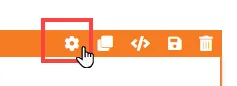
Section titled “Customizing Elements”When you hover over an element, its border will be highlighted in orange. To access an element’s settings, click on the gear ⚙️ icon or click directly on the element.
Advanced Settings
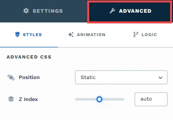
To further customize your container (section, row, column, and element), ClickFunnels provides Advanced settings that allow you to control style, advanced CSS, animation, and rendering logic. We’ve separated these advanced features into dedicated articles to avoid overwhelming you with too much content in one place and to keep our documentation concise. Explore the following resources for more details:
-
Advanced Settings - Customize Styles: Learn how to populate contents dynamically, position containers, apply z-index, and rotate containers without custom CSS.
-
Advanced Settings - Customize Animation: Learn how to add animations, control entry and exit effects, and adjust animation delay.
-
Advanced Settings - Customize Logic: Learn how to apply conditional logic to elements and add custom attributes.
Control Panel
The Control Panel appears at the bottom of every container(Section, Row, Flex, and Element) in the page editor, offering quick access to essential settings and actions for that container. Here’s what each icon represents:

-
ALL: The container will be visible on all devices (desktop, tablet, and mobile).
-
Desktop (🖥️**) Icon**: The container will only be visible in desktop view (screens 771px and wider).
-
Mobile (📱) Icon: The container will only be visible in mobile view (screens up to 770px wide).
-
Eye (👁️) Icon: Use this to hide the container from the page. Once clicked, the container will be hidden in the editor but not deleted. You can click the Layout menu in the top navigation bar to find the hidden containers. Select All, Desktop, or Mobile icon to unhide in the editor.
-
Code (
</>): Opens the code editor for this container, where you can add custom CSS to change its styling. The editor shows the container’s CSS ID Selector so your CSS targets only this container. Open it from the code icon at the top of the settings panel, or hover over the container on the page and click Code in its toolbar. -
Trash (🗑️**) Icon**: Removes the container from the page editor entirely.